Burmilana thread is thicker than rayon and has a wool-like appearance. I had to alter the density of the stitch on my designs, as well as changing the multihead machine needles and altering the tension on the machine.
Friday, 11 December 2015
Combining Texture
After using flock, foil, digital embroidery (rayon thread) with screen print, I wanted to further experiment with textural features on my samples. Using burmilana thread was mentioned in a tutorial, as it would give a softer, matte appearance next to the rayon and compliment the flock.
Burmilana thread is thicker than rayon and has a wool-like appearance. I had to alter the density of the stitch on my designs, as well as changing the multihead machine needles and altering the tension on the machine.
The appearance of the samples now, I feel, is enhanced with the combination of textures and compositions and they are more appropriate for an interiors context. They were flat and not tactile prior to this, which the flock and burmilana add now. The choice of colour is more sensitive and thought out. The transparency of the block shapes is also contemporary and exciting to look at and is an effect I have wanted to achieve from the beginning. I'm really excited by my work and I am looking forward to developing my ideas further.
Burmilana thread is thicker than rayon and has a wool-like appearance. I had to alter the density of the stitch on my designs, as well as changing the multihead machine needles and altering the tension on the machine.
Friday, 4 December 2015
Colour and Design Development
Preparing for the next crit, I realised my work was not focussed - there were a lot of ideas but they weren't developed. Moving forward, I will edit and select pieces that I would like to develop and leave the ones that aren't working behind.
Materials were also a problem, and since the crit I have purchased synthetic upholstery materials so I can combine sublimation printing with screen printing and digital embroidery. I feel they are more sophisticated and appropriate for my context.
The colours I used looked washed out on the fabrics I was using previously, so I have adapted my original colour palette, which I think will compliment the fabrics, to take forward. I do not plan to use the 'fig' colour palette as a result of this as I feel the one below is more suitable for current interior trends.
I prepared a background on the fabrics before working on them with print and embroidery using sublimation printing, flocking and foiling - which is commonly used within interior fabrics and I feel is more playful than what I have created previously. I like having a textured surface to print onto because of the different effects it creates on the fabric when layered up.
Materials were also a problem, and since the crit I have purchased synthetic upholstery materials so I can combine sublimation printing with screen printing and digital embroidery. I feel they are more sophisticated and appropriate for my context.
The colours I used looked washed out on the fabrics I was using previously, so I have adapted my original colour palette, which I think will compliment the fabrics, to take forward. I do not plan to use the 'fig' colour palette as a result of this as I feel the one below is more suitable for current interior trends.
 |
| Developed Colour Palette |
 |
| Sublimation of colours onto sourced upholstery fabrics |
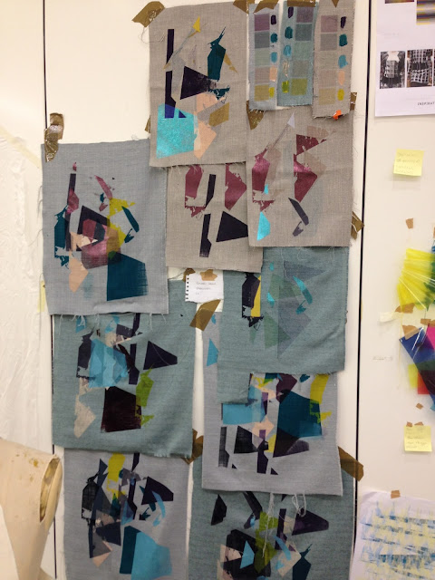
Examples of recent work above - combining flock, foil, embroidery and screen print.
Compared to previous pin-ups of my work, I think my project is really starting to take shape. The fabric choices are far more sophisticated and relevant to my context. The combination of processes, I feel is better thought out and they complement each other. The colours also are much more appropriate than the duller ones I used previously. I could definitely see these fabrics used within an interior environment. I like the simple designs that incorporate just flock and foil, however, the brighter screen-printed ones also are cohesive and relevant to my context.
To move forward, I will further edit and select elements of the samples that work best and adapt these into new designs. I would screen print initially onto the fabrics rather than sublimation printing, as the colours would be richer. It was definitely easier to use a screen rather than newsprint paper, so I will always carry out the process of printing this way from now on.
Subscribe to:
Comments (Atom)


