Pages

Showing posts with label Drawing. Show all posts

Wednesday, 25 March 2015

Investigation 1 - Design Development and Furnishings

Group Project

The focus of my work this week has been on developing designs that are in keeping with the group vision. We decided that a geometric approach would uplift the reception area of 57 Spring Gardens and, with using relatively muted colours with a signature yellow colour (inspired from an image on the group Pinterest board as an accent), we have considered the setting of the designs as to not overwhelm the space. 

After deciding on the colour palette, myself and Jenny began drawing. We both have very different drawing styles - Jenny prefers graphic, black and white drawing, whereas I prefer starting with colour and composition. We plan to combine our drawing styles to create designs which reflect both our work equally.


When considering the type of furniture we might place in the reception area, we decided that it would be better if the patterns were only on part of the chairs or sofas because they are quite heavily patterned and it would be difficult to match the pattern around the surface of the furniture. Myself and Jenny had an idea after discussing it with Michelle in a tutorial that we could choose part of the furniture such as a cushion and use Velcro so it could be detached. However, when we pitched this to the rest of the group, they didn't understand the detachable feature, and Simone pointed out that personalised furniture would be too time consuming and costly to make. Moreover, with Bruntwood being a commercial company, the likelihood of them wanting to spend their time and money on bespoke furniture is very slim. As a result, we have begun research into different types of furniture that we could suggest Bruntwood could purchase for the area, but that are also in-keeping with the other design features within the space. We could however, still present our prints to Bruntwood as they could be used on a smaller scale, such as for soft furnishings.

We looked at both chairs and sofas, to determine what would fit best within the space we were allocated. We discussed a few options of where they could be placed - for the Blue-Sky option, we discussed sofa pods on the higher level, facing outwards, so that people can still be identified but it is also slightly secluded and offers a breakout space for Bruntwood's clients. The dimensions of the space as it is currently would not allow a chair pod at either side of a coffee table in front of the lifts, so we looked at chairs too, as they would fit in the space. I think it would be more proactive and beneficial to the project if the group decided on the CAD designs to focus on first, before deciding on furniture for the space as we don't yet know what space we have for chairs and tables yet.

After this weeks tutorial and being told our furniture designs were going to be too costly to make, myself and Jenny felt a little bit lost as to what we could contribute towards the group project, so we discussed ways that we could still design something for the space. We reached a decision that we could take inspiration from Bolon (a flooring company) and create our own flooring design using geometric shapes. We felt that if the design was to be across the whole of the reception area, it would be too much and would not be appropriate for the client. As a result, we will design a strip of carpet tiles that will go underneath the seating area, with plain chairs on top. This way, there can be some design input, but not so that it overpowers the space.

Individual Project

With regards to individual projects, me and Jenny possess different skills that we felt would allow us to create a stronger body of work if we worked collaboratively with each other. We have discussed the possibility of laser-cutting into a table top, as I have had an induction last year, rather than suggesting pre-made tables for Bruntwood. I feel that with Jenny's skills in print, she could possibly design a screen to print onto the wood first, then I can design the laser to combine our skills and techniques. I will work on designs for the laser and sourcing appropriate materials over the Easter break so that we can get straight on with sampling and experimenting when we return, so we are managing our time effectively

Monday, 22 December 2014

Locating - Visual Research

Throughout the first two weeks of this project I have visited Manchester Museum to gather images from their Siberia Exhibition including full size animal and human skeletons. From these images I have concentrated on developing a series of drawings based around the concept of 'Anatomy'. They have a graphic, linear quality to them as well as abstract shapes so they could be translated effectively onto the Ethos Software and Multi-head as well as the possibility of laser cutting parts or engraving them. The colours I've used in my drawings are relatively subtle, although some are more brightly coloured, but within a colour palette that suits the idea of 'Anatomy' - reds and blues (like veins) and oranges and whites (like bones). I have manipulated some of the drawings in Photoshop to enhance the best bits of the selected drawings and merge elements together to create new drawings.


The edit above appears as though the hand is squeezing the heart and the lungs are being pushed out the side. It was a bit of a 'happy accident', but I like the mix of abstract smudges in the background with the graphic lines in front. I think if I was to use the same visual research for the 'Engineering Embroidery' brief I would have to make the shapes more abstract so they would be suitable for the high-end car interior market - my focus over Christmas. The colours would also have to be subtler or cover less fabric to be appropriate for the market.


I intend to develop the concept of 'Anatomy' into designs for the Multi-Head machine that become more abstract compositions so I could also use the ideas for the live brief 'Engineering Embroidery' as samples to fit in a high-end car interior. After discussions in my tutorial, I now intend to create more drawings using acetate so I can really explore the idea of human AND animal anatomy merged together (similar to the frog skeleton image above) - this will be my focus for the Christmas break.


Sunday, 12 October 2014

Visual Research Development


After my last tutorial, my group and my tutor suggested that I begin to come out of my comfort zone within my sketchbook and start to create some 3D pieces from my drawings, in order to push myself forward. Similarly, with a context in mind of costume or set design, we all thought that creating something 3D would be more relevant and would relate more closely to these industries, as both involve working in a 3D manner as they design. It was also suggested that I begin to look into window dressing, as it involves both the body and interior space.

I researched into a couple of designers; Rei Kawakubo and Issey Miyake who both create unusual garments, some using organic shapes and some geometric. Out of the two, I prefer Issey Miyake's work (below, right) as it is slightly more structured, and appears to use stiffer, more industrial materials than Rei Kawakubo (below, left), which appears to be made from softer materials, which are manipulated and stuffed to create unusual shapes.


Matt Shlian designed a shop window display for Levi's made solely out of paper, which also was made up of geometric shapes such as hexagons and pyramids. From this, I realised the works I have looked at over the past week would assist me in considering my audience more closely - such shapes could be used in both costume and set design, as well as installations in shop window dressings - see below.


I have begun designing compositions from my drawings using 3D geometric shapes similar to the ones that Matt Shlian used in his Levi's installation as well as Issey Miyake. 


The mix of colours with the figurative elements from my drawings, I think, work well as they make the shapes look even more abstract. In contrast, it also adds depth and sharpness to the 3D shapes. Moreover, with the mixture of dark and brighter colours, this would suit the audiences I mentioned before as costume and set need to be bright in order for them to be clearly defined under lighting. In contrast, a shop window display could be plain, dark or colourful, depending on the client and their store vision.


Friday, 3 October 2014

Intentions - Visual Research Week 1 - Urban Influences

To start my visual research I began searching for artists on Pinterest that work using architecture and the urban environment. I found several artists that use geometric shapes in their work as well as other artists that take a more abstract approach - fitting in perfectly with the drawings I worked on over the summer period.


Dario Moschetta and Karen Benedetti


I have thought about the concept that I adopted over the summer project - 'Disguise and Cover-Up', and by using the urban environment to cover and disguise other things I have managed to include concepts such as; homeless people, new buildings covering old, and detail covering abstract which all still link to my summer concept.


During this first week of the visual research task, I began to collect images of buildings that had geometric shapes in their architecture so I could draw the lines (working in a figurative way). I wanted to find buildings that had an older quality and some that are relatively modern, so to do this I visited Manchester City Centre and MediaCityUK to achieve the contrast I desired. 


After doing several figurative drawings of both buildings and homeless people, I felt my work lacked colour and, as I am an embroiderer, colour is a very important element. Using different wet media and my Costa Loyalty Card, I created backgrounds in which I could layer the drawings over. This is in keeping with my concept 'Disguise and Cover-Up' as the paper dims the colour down slightly in areas.


Whilst thinking about the composition of the architecture in my backgrounds, I picked out elements of detail on the buildings for the foreground. The way the abstract and figurative are collaborated, I believe, make the drawings more interesting to look at and also underpin the concept effectively because of the media used.

Disguise and Cover-Up - Summer 2014


Amy Judd's work is uniquely 'weird' in a sense that she almost creates a disguise by using animal features such as butterflies and birds to cover up the human face. 


'Ascending Athena' and 'The Weight of a Thousand Feathers' (above) are two of her pieces that particularly sparked ideas in my head for further development. I linked this with another one of her pieces where a butterfly covers a girl's face by using segments of a butterfly wing to fan like the feathers on the other images I found. I think her work could relate to either gallery work or the costume industry as it involves the human body as well as animal features.


Using Judd's work to influence my own, I used butterfly wing segments in order to create a feathered effect like in her pieces with bird feathers.


Extending a section of a butterfly wing using watercolour and acrylic paints. This drawing works well because the textures and colours can be related to embroidery relatively easily and effectively. This piece of work could be improved by working in a more abstract manner, using similar colours, and collaborating figurative drawing with abstract colour smudges.

Tuesday, 2 September 2014

Influences and Inspirations (2)

After researching images relating to disguise on Pinterest, I found that the ones that inspired me the most were the three in my previous post.

I went on to create collages of faces (as seen in my previous post - Waldemar Strempler) by cutting up the facial features of the people in magazines and rearranging them appropriately to create a new face - a 'disguise'. Some of the people look abstract, whereas others quite suit their new features. 


I mixed the idea of disguise with peacock feathers again to create more drawings - using the shapes of the peacock pattern to cover the eyes of someone, for example. I also used similar spherical shapes to create a collage covering the eyes of someone (above top right) - similar to Anton Bundenko.


Looking back at the work of Januz Miralles again, which I found earlier, I have distorted my own collages and found photographs of the human face (in the style of Waldemar Strempler) in order to create some more drawings. Adding different media such as acrylic paints and ink to the distorted images makes them more abstract and like a 'disguise' or a 'cover-up' and relates to the work of Miralles, also. 


I wanted to investigate the idea of disguising the face using other methods, such as covering up aspects of it with an object, or replacing features all together with something totally different - see my Pinterest (http://www.pinterest.com/rmlhaigh/disguise/) for other inspirations from artists such as Amy Judd, who uses animal features to cover the human face. Below, I used the ideas behind her work, teamed with the concept of an image of Twiggy that I discovered on Pinterest, to create my own piece.


I would say my work could be tailored towards the costume industry as I enjoy working with unusual concepts, in a three-dimensional manner. I like working in an abstract way as Miralles and Strempler do, though I am also inspired by unusual and shocking images like Amy Judd and Anton Bundenko create.

Luly Yang is a designer based in Seattle, USA, who predominantly creates gowns and bridal dresses, however, she also is involved in making Haute Couture fashion pieces such as 'The Monarch'.


 It is a custom silk taffeta butterfly print skirt and corset bodice, embellished with hand placed Swarovski crystals and black ostrich feathers. 


Friday, 14 February 2014

Painting Manipulation - 14th February 2014

The first part of the drawing day task was to create paper structures that related to your textile world work. 

The second task was to draw them using different media. I decided to shine a lap through my paper structures in order to capture the shadows from them. I then shaded in the negative space in order to create an abstract outline from the shape.

I used charcoal to shade between the concertina shapes in order to outline the shadow. I like the abstract effect it gave and the movement of the charcoal stick made scratchy lines on the page and got close into the creases of the paper.

My second shape was simply cut shapes into a piece of paper. I then projected a lamp through the holes and shaded the shadows created. They created a chevron shape which I then smudged (see below) in order to create the illusion of light projection.

I like the way that the lines look like they're moving when they are flat on the page. I also think the drawing looks 3D with the smudges which relates well to my textile world.

Monday, 3 February 2014

Mechanical Drawing - 31st January 2014

For this drawing day I brought in some wooden clothes pegs, hair rollers, ink, paint brushes and cocktail sticks in order to experiment with different ways of mark making.
Wooden clothes peg dipped in ink and opened and closed onto the paper. I like the simplicity of the marks and the abstract texture that it portrays.

Cocktail stick dipped in ink. I simply drew spirals on the page in different sizes to alude to the idea of knots in trees. I would have liked to overlap them more in order to make the drawing more abstract.


Hair roller and ink. I rolled a velcro hair roller in ink and rolled it across the page to make small scratchy marks on the paper. I then dabbed the end of the roller onto the page and it made semi-circles which I liked the illusion of a 3D textured surface that it gave.


The two drawings above were created by dabbing ink onto the page and using a drinking straw to blow the ink and create a line. I moved the straw from side to side in order to create a distorted line. The outcome reminds me of tree branches that are twisted and contorted which I feel links in with the theme of my current project 'Nature'.


When I poured the left over ink into the sink after the drawing day it made this pattern which reminded me of my work from the day. I could develop this into another drawing in the future.


Thursday, 30 January 2014

Daksha Patel Drawing Workshop

Daksha Patel is an artist that works in unusual ways and is inspired by the human body - one of her pieces 'Fat Drawing' depicts a brain which has been drawn using fat in order to make the drawing translucent. 

She arranged a collection in the centre of a table which incorporated lots of different objects. She wanted the group to find links between objects that interested us and draw them, with linking words alongside them. 


I used mark making techniques to draw moss, a bird's wing, a ram's skull, a barnacle and a pinecone. The link I found between the items was that they are all natural objects. They all degrade over time and decay also.


From the workshop I learned that an archive collection can look random and thrown together, however if you look closely you can create links between the items in order to find deeper meaning.


Monday, 20 January 2014

'Distort and Warp' Drawing Day (17th January 2014)

From the 'Distort and Warp' brief that was given to me, I was instantly inspired to create something different from what I would usually do
Initially, I sketched the outline of the half orange I brought in as a starting point. I simplified it down so that it would be easier to distort later on. After sketching the outline, I filled the 3 shapes in with gouache with reference to the natural colours I have used so far in my Mixed Media project, 'Earth as Data'.
This sample reminded me of the roots of a tree.

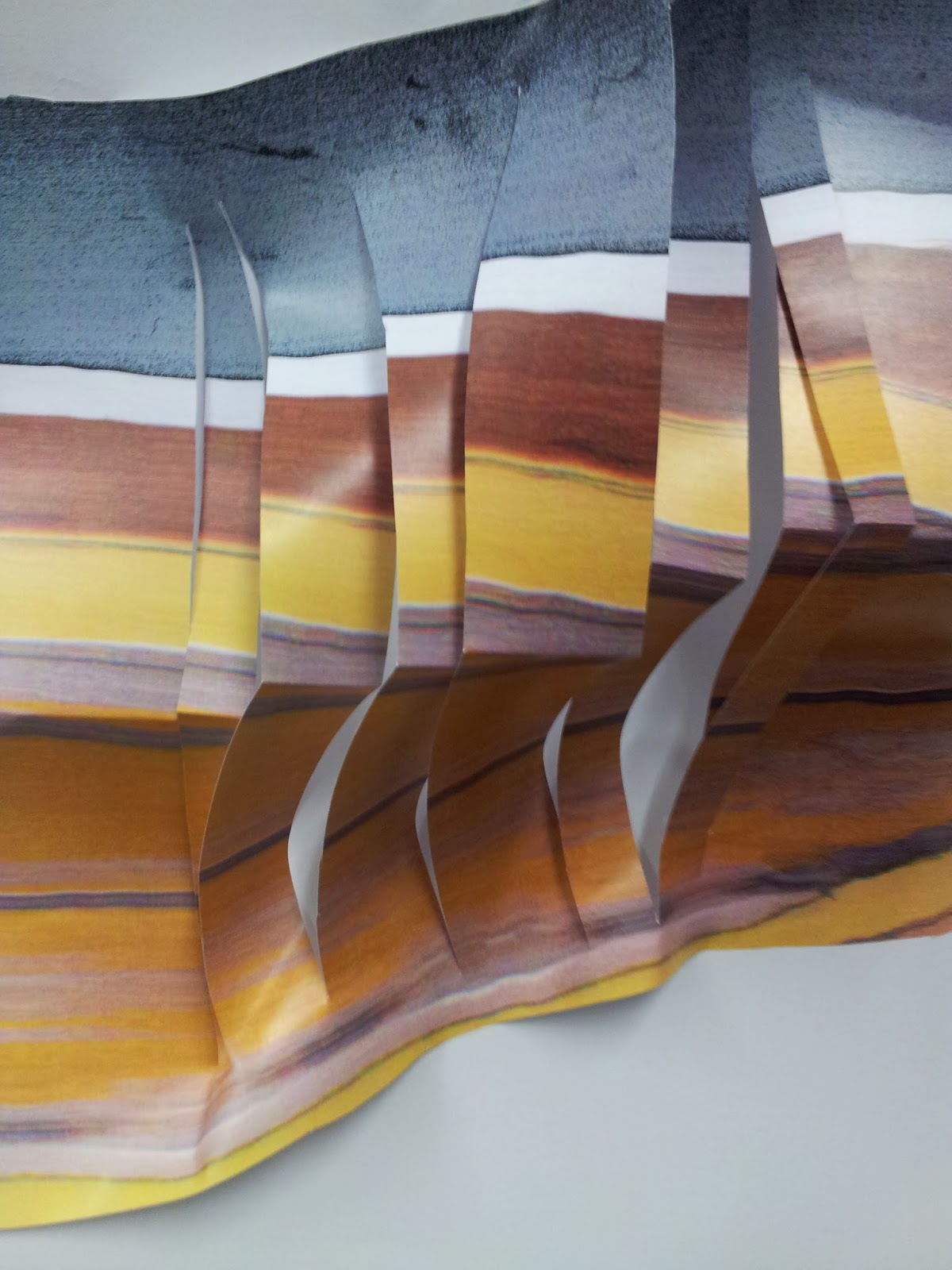
Once dry, I dragged the paintings across the photocopier to manipulate the images and to stretch them out. I had a happy accident doing this and discovered that one of the copies looked like the tree rings that I had focused on previously in my project. In order to distort the copies further, I created 3D structures from them which further related to my Mixed Media project. Some of the samples were simply cut, whereas others were stuck together to create the structures.

Cut out photocopy which looked like tree rings into a knot in the wood.


I like the linear qualities of the copies and the way that through distorting the original painting I could create a more abstract image which related more to my project.