Pages

Showing posts with label L6. Show all posts

Thursday, 28 January 2016

Michael Kidner

For the presentation, I've produced fabric samples so the Kidner family have something tactile alongside the other proposals. I've also created some wide-format banners which I will print if I win the commission.


Focussing on Michael's use of colour alongside the idea of illusion and op-art, with the combination of processes, if produced to a large scale, would be powerful within a gallery environment as they would be visible from afar and would be tactile. If the Kidner family like the idea of embroidery within the commission, I would have to produce the banners on fabric as paper would tear.
 
The large scale banners would be printed 2.5m long and up to 84cm wide.


Art in the Office

Art within a corporate environment can break up the clinical feel that the majority of spaces possess and can enhance the productivity of the workforce according to The Guardian. 


The large scale and tactility of my final collection of samples is ideal for my context, creating interest within a corporate space. The combination of graphic city imagery is also suited to my context as the majority of corporate spaces are situated within a city environment, and somewhat provide an escape from the hustle and bustle of city life.

Sunday, 24 January 2016

Finalising Ideas

After careful consideration and planning, my final collection of samples is becoming more resolved. The context for this particular work has altered slightly from the start of the project - from interior textiles for the home to interior artworks for a corporate space. With this in mind, the scale of the samples needed some attention.
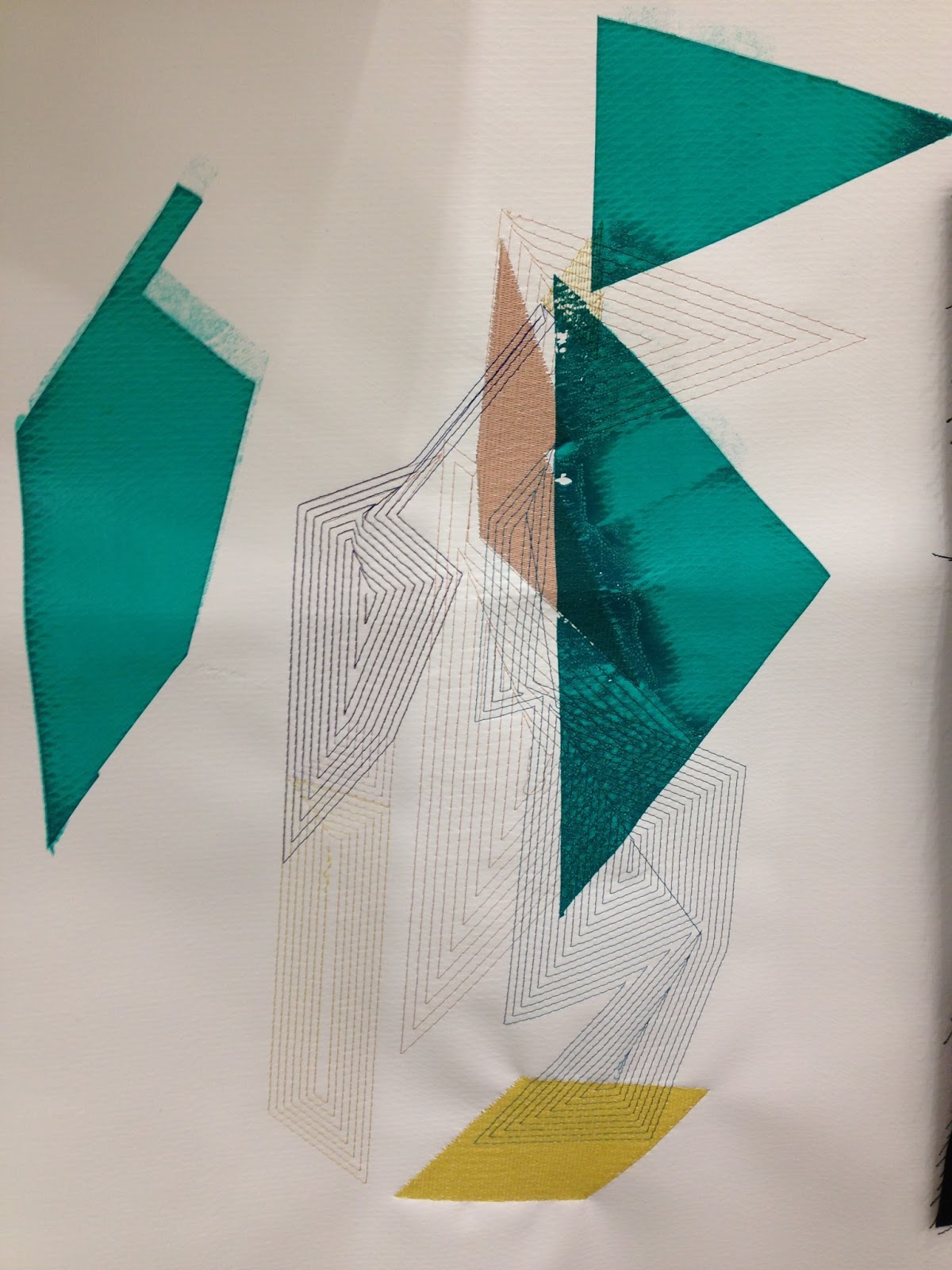
The A2 screen designs really make an impact on the surface of the fabrics used, and combined with other processes make the samples dramatic. The graphic screens are far more fascinating than previous block designs and the negative spaces give the samples character.


The combination of textures on the surface has improved the tactility of the samples, which works in favour of my context.
Up scaling the embroidery designs gives a more spectacular appearance, and creating my own stitch on the software has meant they appear translucent when stitched over the print. By carefully selecting and planning which colours to use, I discarded the pale pink printing ink as it wasn't vibrant enough on the fabrics. I have however incorporated it into some of the digital embroidery where I saw appropriate as the translucency of the thread was more effective over darker shades.


Friday, 15 January 2016

Planning

Over the Christmas period, I developed graphic A2 screens to be printed on returning to the studio, which are more appropriate for the context of my work. Previous samples looked thrown together, so I’ve planned 6 final samples. I will screen print onto upholstery fabrics first, followed by flock, foil and digital embroidery using burmilana threads, being more selective about the colour choices and compositions on the fabrics. I’ll produce large scale embroidery designs to work with the A2 prints as previous designs were lost amongst the overpowering smaller print.


For the Michael Kidner brief, I have rekindled the idea of banners from the beginning of my self-initiated project. I’m wanting to work at large scale to produce bespoke banners which would be powerful within a gallery environment. My Photoshop work over Christmas has been concentrated on Michael’s use of colour combined with op art, then developed into large scale designs to be pitched to the Kidner family. I will produce some fabric samples too, so the Kidner have something physical to look at.


Friday, 11 December 2015

Combining Texture

After using flock, foil, digital embroidery (rayon thread) with screen print, I wanted to further experiment with textural features on my samples. Using burmilana thread was mentioned in a tutorial, as it would give a softer, matte appearance next to the rayon and compliment the flock.

Burmilana thread is thicker than rayon and has a wool-like appearance. I had to alter the density of the stitch on my designs, as well as changing the multihead machine needles and altering the tension on the machine.


The appearance of the samples now, I feel, is enhanced with the combination of textures and compositions and they are more appropriate for an interiors context. They were flat and not tactile prior to this, which the flock and burmilana add now. The choice of colour is more sensitive and thought out. The transparency of the block shapes is also contemporary and exciting to look at and is an effect I have wanted to achieve from the beginning. I'm really excited by my work and I am looking forward to developing my ideas further.


Friday, 4 December 2015

Colour and Design Development

Preparing for the next crit, I realised my work was not focussed - there were a lot of ideas but they weren't developed. Moving forward, I will edit and select pieces that I would like to develop and leave the ones that aren't working behind.

Materials were also a problem, and since the crit I have purchased synthetic upholstery materials so I can combine sublimation printing with screen printing and digital embroidery. I feel they are more sophisticated and appropriate for my context.

The colours I used looked washed out on the fabrics I was using previously, so I have adapted my original colour palette, which I think will compliment the fabrics, to take forward. I do not plan to use the 'fig' colour palette as a result of this as I feel the one below is more suitable for current interior trends.

Developed Colour Palette
Sublimation of colours onto sourced upholstery fabrics
I prepared a background on the fabrics before working on them with print and embroidery using sublimation printing, flocking and foiling - which is commonly used within interior fabrics and I feel is more playful than what I have created previously. I like having a textured surface to print onto because of the different effects it creates on the fabric when layered up.


Examples of recent work above - combining flock, foil, embroidery and screen print.


Compared to previous pin-ups of my work, I think my project is really starting to take shape. The fabric choices are far more sophisticated and relevant to my context. The combination of processes, I feel is better thought out and they complement each other. The colours also are much more appropriate than the duller ones I used previously. I could definitely see these fabrics used within an interior environment. I like the simple designs that incorporate just flock and foil, however, the brighter screen-printed ones also are cohesive and relevant to my context.

To move forward, I will further edit and select elements of the samples that work best and adapt these into new designs. I would screen print initially onto the fabrics rather than sublimation printing, as the colours would be richer. It was definitely easier to use a screen rather than newsprint paper, so I will always carry out the process of printing this way from now on. 

Monday, 30 November 2015

Contextual References

Callagio Fabric - https://www.designersguild.com/uk/fabric/designers-guild/calaggio-turquoise-fabric/p7180


Flocking for an interior context - I will experiment with this to create more desirable interior fabric samples and combine with other processes - Love the surface texture!

 
 Mareike Bohmer - Geometric designs inspired by the city. I have been influenced by the transparency and composition of her work - it made me think more carefully about placement on my samples before printing onto them.


Tamasyn Gambell - Interior context, similar colour scheme, geometric designs. She uses yellow as an accent colour - similar to my own work.

Thursday, 19 November 2015

Screen Print Development


After carrying out more detailed visual research and drawing, I began to think about how these could be screen printed. The technician advised that newsprint paper and a scalpel to cut stencils out would be a quick way to test the designs out on fabric. I found this to be quicker and easier, until I tried to screen print with the stencils. The paper could only be used with one colour as washing the screen would mean the paper would tear away. On reflection, I would only use newsprint again if I was screen printing a small design, not on large designs which I would expose a screen for.

Neutral Painting Linen

Black Brushed Cotton
White PVC
Out of the samples above, I believe the PVC as a background is a little stark for an interiors context. My designs look better integrated onto a neutral or black background and the effect created when the printing inks are layered over one another, particularly on the black fabric reinforces the geometric and transparent element I wanted to capture throughout this project. I enjoyed the process of using digital embroidery alongside screen print and combining them - when printing on top of the embroidery, the ink misses sections which is quite effective, and the stitch on top of the print also adds a graphic quality.

I would consider using the PVC for a live brief such as Michael Kidner as I feel it would be more effective for installation and gallery work rather than for an interior context.

Saturday, 7 November 2015

Colour


Debenhams Autumn/Winter 2015
After the latest crit, I tried to develop another colour palette by photographing fruits which have a purple skin, such as figs and passion fruits as this colour is prominent within current interior fabrics in retailers such as Debenhams and John Lewis. I also agreed with my tutor when discussing that some of my recent samples looked a little 'washed out' on a white background.

 
Fig Colour Palette
Passion Fruit Colour Palette
After experimenting with these colour palettes within my samples this week, my favourite is the fig as it incorporates purple alongside an 'accent' colour which in this case is a medium yellow tone. I plan to carry on with sampling for my self-initiated project to be directed towards an interiors context. I would like to mix screen print and digital embroidery for my next samples and play with material and colour compositions.

Monday, 26 October 2015

2-Tutor Crit and Development

Preparing for the 2-tutor critique was a little daunting. I prepared two boards for the Bradford Textiles brief which were different in style (see below). I felt quite limited with scale throughout these initial four weeks, as I was focussed on producing a sample board for submission. My tutors agreed that I need to think more carefully about the scale of my sampling and 'go for it' for the next project. I'm excited to try something that I haven't done in the past and see what the results will look like.


From the crit, I plan to continue with this project for my self-initiated brief, but focus more on the scale of my samples by using print screen techniques onto large scale fabrics. I feel this would enable me to widen my creative knowledge and would also demonstrate a more 'bespoke' feel - the original idea behind the large scale sampling. To reflect the scale I want to achieve, I have created some A2 drawings using collaging techniques which can then be translated into screens. I will leave the idea of a large scale banner to a live brief, and concentrate on fabric samples for an interior context.


The two collages above were the most successful as I feel they depict my concept the best. I also think the placement of the detailed pen drawing is better considered than some of my other drawings.

Tuesday, 20 October 2015

Sampling


Over the last couple of weeks I have developed Photoshop designs from my initial drawings of collaged 'banners' inspired by work from a previous unit X project to be digitally printed. However, the outcomes of these prints were not what I wanted; the colours were too dark and the fabric choices were not right for the effect I wanted to achieve. The sublimation printer can only print onto synthetic fabrics, but I thought I would be able to achieve a closer effect to paper using this technique with the selection of fabrics on offer to me. I was also advised by the embroidery technicians that I would not be able to stitch onto paper using the multi-head embroidery machine as it would tear easily, so I began experimenting with Paper Nylon and Poly Taffeta - both thin fabrics with an appearance similar to paper.
Poly Taffeta
 
Paper Nylon


The sublimation ink absorbed better into the Poly Taffeta than the Paper Nylon, which I think was due to the Paper Nylon feeling as though it had a covering on the surface - my prints were much fainter. I do think both types of fabric were effective, however I prefer how the colours appear on the Nylon with the embroidery as it appears three-dimensional. I produced A4 and A3 banners as these were the restricted sizes available. On reflection, I would have liked to produce a larger scale sample using the sublimation printing method, similar to the paper roll I experimented with in week one of the project, which is a development I could make in future.


When it came to designing a digital embroidery pattern on the ethos software, I hadn't considered the size of the stitch out frame – I hadn't used the software for about 6 months prior to this so it took a while to get used to. Moreover, when it came to stitching my designs out on the multi-head machine, I realised some of my designs were still too large, meaning I had to rescale them and use the sash frame on the machine. It was also difficult to line my designs up with the prints, and in future I will create a reference point on the fabric if I am stitching directly over one particular shape. Furthermore, because the sash frame extends further than the machine front, it can get stuck on the sides, which causes the design to move over the fabric. Although this was unintentional on the mustard colour sample (above), I love how the stitching adds depth to my design, and reinforces the transparency that I wanted to achieve towards the beginning of the project on Photoshop.

Similarly, the embroidery design below, that has been stitched on top of one of my original drawings, reinforces the water marks on the fabric and adds depth and texture to the flat printed design. I intend to explore this further at a later date in the Practice unit.


I will submit an A3 sample for the Bradford Brief as I feel a larger scale sample would be inappropriate to illustrate using the boards which I will put together. I plan to continue creating samples for an interior context, alongside experimenting with scale in the live brief element of the project.


Sunday, 11 October 2015

Contextual Research

I usually find contextual research difficult, in that I never know where to start looking. However, I began this project by looking at store websites that I believe my work could be appropriate for, such as Next, John Lewis and Debenhams. From these websites I came across Scion and Sanderson, who are companies that specialize in fabric furnishings and wallpaper.


The two images above, I feel reflect my work in some ways: shape, transparency, colour and style. They have an abstract feel about them, which is a way in which I enjoy working.

Additional samples I ordered from the John Lewis website are shown below. They have similarities to my own designs in that they have transparent areas, geometric shapes, and a graphic linear quality.

John Lewis fabric samples

Custhom embroidered wallpaper samples
The texture of the thread against the smooth paper contrasts with each other, which I feel I could push forward within my own project. I should consider a heavy weight of paper, almost like a fabric if I do use digital embroidery onto paper to achieve these effects, whereas thin printer paper is likely to tear during the machine stitch out.


Sanderson fabrics featured on the John Lewis homeware website, and these particular samples above, (Dandelion Clocks) depicted the mix of colours that I would like to use within my own work. However, after the samples arrived, I didn't feel they gave the best idea of the colours together as there were only small areas of one colour on some of them, which was disappointing. I did, however, have enough of each colour to create swatches on Photoshop to potentially use within my own work.


The Debenhams Autumn/Winter15 Home Catalogue has some fantastic colour inspirations for my work - I knew that I wanted to use purple shades within my work, but seeing the colours within a home environment within the catalogue really helped me to understand the shades that would compliment other colours. I plan to scan the relevant colour pages into Photoshop to create swatches that have more of a sensitivity and warmth to them, compared to other palettes used previously.