Pages

Thursday 28 January 2016

Michael Kidner

For the presentation, I've produced fabric samples so the Kidner family have something tactile alongside the other proposals. I've also created some wide-format banners which I will print if I win the commission.


Focussing on Michael's use of colour alongside the idea of illusion and op-art, with the combination of processes, if produced to a large scale, would be powerful within a gallery environment as they would be visible from afar and would be tactile. If the Kidner family like the idea of embroidery within the commission, I would have to produce the banners on fabric as paper would tear.
 
The large scale banners would be printed 2.5m long and up to 84cm wide.


Art in the Office

Art within a corporate environment can break up the clinical feel that the majority of spaces possess and can enhance the productivity of the workforce according to The Guardian. 


The large scale and tactility of my final collection of samples is ideal for my context, creating interest within a corporate space. The combination of graphic city imagery is also suited to my context as the majority of corporate spaces are situated within a city environment, and somewhat provide an escape from the hustle and bustle of city life.

Sunday 24 January 2016

Finalising Ideas

After careful consideration and planning, my final collection of samples is becoming more resolved. The context for this particular work has altered slightly from the start of the project - from interior textiles for the home to interior artworks for a corporate space. With this in mind, the scale of the samples needed some attention.
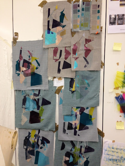
The A2 screen designs really make an impact on the surface of the fabrics used, and combined with other processes make the samples dramatic. The graphic screens are far more fascinating than previous block designs and the negative spaces give the samples character.


The combination of textures on the surface has improved the tactility of the samples, which works in favour of my context.
Up scaling the embroidery designs gives a more spectacular appearance, and creating my own stitch on the software has meant they appear translucent when stitched over the print. By carefully selecting and planning which colours to use, I discarded the pale pink printing ink as it wasn't vibrant enough on the fabrics. I have however incorporated it into some of the digital embroidery where I saw appropriate as the translucency of the thread was more effective over darker shades.


Friday 15 January 2016

Planning

Over the Christmas period, I developed graphic A2 screens to be printed on returning to the studio, which are more appropriate for the context of my work. Previous samples looked thrown together, so I’ve planned 6 final samples. I will screen print onto upholstery fabrics first, followed by flock, foil and digital embroidery using burmilana threads, being more selective about the colour choices and compositions on the fabrics. I’ll produce large scale embroidery designs to work with the A2 prints as previous designs were lost amongst the overpowering smaller print.


For the Michael Kidner brief, I have rekindled the idea of banners from the beginning of my self-initiated project. I’m wanting to work at large scale to produce bespoke banners which would be powerful within a gallery environment. My Photoshop work over Christmas has been concentrated on Michael’s use of colour combined with op art, then developed into large scale designs to be pitched to the Kidner family. I will produce some fabric samples too, so the Kidner have something physical to look at.


Friday 11 December 2015

Combining Texture

After using flock, foil, digital embroidery (rayon thread) with screen print, I wanted to further experiment with textural features on my samples. Using burmilana thread was mentioned in a tutorial, as it would give a softer, matte appearance next to the rayon and compliment the flock.

Burmilana thread is thicker than rayon and has a wool-like appearance. I had to alter the density of the stitch on my designs, as well as changing the multihead machine needles and altering the tension on the machine.


The appearance of the samples now, I feel, is enhanced with the combination of textures and compositions and they are more appropriate for an interiors context. They were flat and not tactile prior to this, which the flock and burmilana add now. The choice of colour is more sensitive and thought out. The transparency of the block shapes is also contemporary and exciting to look at and is an effect I have wanted to achieve from the beginning. I'm really excited by my work and I am looking forward to developing my ideas further.


Friday 4 December 2015

Colour and Design Development

Preparing for the next crit, I realised my work was not focussed - there were a lot of ideas but they weren't developed. Moving forward, I will edit and select pieces that I would like to develop and leave the ones that aren't working behind.

Materials were also a problem, and since the crit I have purchased synthetic upholstery materials so I can combine sublimation printing with screen printing and digital embroidery. I feel they are more sophisticated and appropriate for my context.

The colours I used looked washed out on the fabrics I was using previously, so I have adapted my original colour palette, which I think will compliment the fabrics, to take forward. I do not plan to use the 'fig' colour palette as a result of this as I feel the one below is more suitable for current interior trends.

Developed Colour Palette
Sublimation of colours onto sourced upholstery fabrics
I prepared a background on the fabrics before working on them with print and embroidery using sublimation printing, flocking and foiling - which is commonly used within interior fabrics and I feel is more playful than what I have created previously. I like having a textured surface to print onto because of the different effects it creates on the fabric when layered up.


Examples of recent work above - combining flock, foil, embroidery and screen print.


Compared to previous pin-ups of my work, I think my project is really starting to take shape. The fabric choices are far more sophisticated and relevant to my context. The combination of processes, I feel is better thought out and they complement each other. The colours also are much more appropriate than the duller ones I used previously. I could definitely see these fabrics used within an interior environment. I like the simple designs that incorporate just flock and foil, however, the brighter screen-printed ones also are cohesive and relevant to my context.

To move forward, I will further edit and select elements of the samples that work best and adapt these into new designs. I would screen print initially onto the fabrics rather than sublimation printing, as the colours would be richer. It was definitely easier to use a screen rather than newsprint paper, so I will always carry out the process of printing this way from now on. 

Monday 30 November 2015

Contextual References

Callagio Fabric - https://www.designersguild.com/uk/fabric/designers-guild/calaggio-turquoise-fabric/p7180


Flocking for an interior context - I will experiment with this to create more desirable interior fabric samples and combine with other processes - Love the surface texture!

 
 Mareike Bohmer - Geometric designs inspired by the city. I have been influenced by the transparency and composition of her work - it made me think more carefully about placement on my samples before printing onto them.


Tamasyn Gambell - Interior context, similar colour scheme, geometric designs. She uses yellow as an accent colour - similar to my own work.