Pages

Monday 22 December 2014

Locating - Visual Research

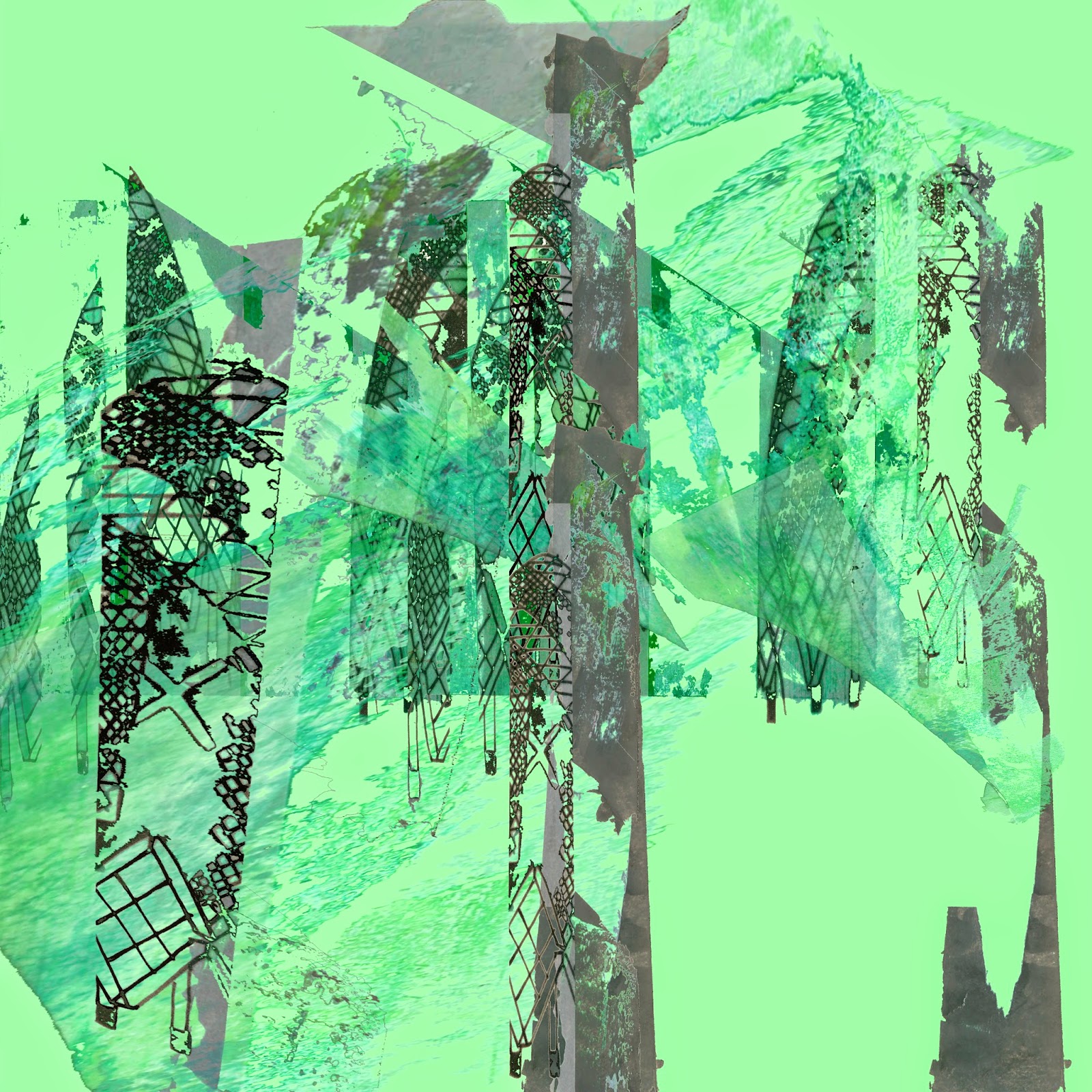
Throughout the first two weeks of this project I have visited Manchester Museum to gather images from their Siberia Exhibition including full size animal and human skeletons. From these images I have concentrated on developing a series of drawings based around the concept of 'Anatomy'. They have a graphic, linear quality to them as well as abstract shapes so they could be translated effectively onto the Ethos Software and Multi-head as well as the possibility of laser cutting parts or engraving them. The colours I've used in my drawings are relatively subtle, although some are more brightly coloured, but within a colour palette that suits the idea of 'Anatomy' - reds and blues (like veins) and oranges and whites (like bones). I have manipulated some of the drawings in Photoshop to enhance the best bits of the selected drawings and merge elements together to create new drawings.


The edit above appears as though the hand is squeezing the heart and the lungs are being pushed out the side. It was a bit of a 'happy accident', but I like the mix of abstract smudges in the background with the graphic lines in front. I think if I was to use the same visual research for the 'Engineering Embroidery' brief I would have to make the shapes more abstract so they would be suitable for the high-end car interior market - my focus over Christmas. The colours would also have to be subtler or cover less fabric to be appropriate for the market.


I intend to develop the concept of 'Anatomy' into designs for the Multi-Head machine that become more abstract compositions so I could also use the ideas for the live brief 'Engineering Embroidery' as samples to fit in a high-end car interior. After discussions in my tutorial, I now intend to create more drawings using acetate so I can really explore the idea of human AND animal anatomy merged together (similar to the frog skeleton image above) - this will be my focus for the Christmas break.


Thursday 20 November 2014

Evaluation of 'Intentions' Unit

 
Throughout the unit I have developed the way in which I think about sampling and research - I have found inspiration much more easily than in previous projects. This could be due to the fact that I considered a context for my work relatively quickly after the project begun; I created drawings in a way that I haven't tried before, or I have found ways to develop samples more easily than last year.
 
I have enjoyed learning new techniques and ways of working in the embroidery area, such as the Ethos Software and Multi-Head Stitch-Out, and Photoshop techniques. The Photoshop workshops, in particular, have allowed me to experiment with compositions to work out what would be most suitable for my project and context. I would like to use these new techniques in future projects as they have helped me to develop ideas into physical samples.
 
My work ethic throughout the project has allowed me to complete, as well as thoroughly explore the techniques I have used, although I have felt far more relaxed than in first year. The tutorial system of only having one meeting a week, I feel, has allowed me to work more freely and experiment and develop ideas more easily.

The initial concept underpinning my work was 'Disguise and Cover-Up' which influenced my project more literally nearer the beginning due to the media I used. The idea of 'Urban Influences' allowed me to explore structures as well as shape - I was inspired by the 'old and new' aspect of the architecture between the City Centre and Media City which contributed to the graphic quality throughout my work, as well as enabling me to explore structures and 3D compositions. Moving forward from my initial drawings, I concentrated more closely on the colours and compositions which have played a bigger part in the samples I worked on, rather than a concept itself.

 
Throughout visual research my main influences were Dario Moschetta, because of his abstract use of colour, and Issey Miyake for his structural garments. These have been main themes throughout my work and have enabled me to explore new pathways.

The context for my work is a mixture of Window Displays and Visual Merchandising, Costume and Set Design. I would say that this helped to portray a diluted concept as these could all be referenced as 'disguise' or 'cover-up'. The context influenced the way in which I planned samples due to the scale and colour use, as the context for my work would require large samples with bold colours.


The above images have influenced my samples the most due to the element of structure and detail in them. I prefer the green colour palette, but the graphic qualities of the pink image.
 
My most successful sample was using the Multi-Head embroidery machine and incorporates graphic qualities and complimentary colours in a large scale that would be appropriate for my context. The fabric is suitable for draping as a backdrop, and the colours are bold enough to be seen from a distance which is an important factor in public displays.

 
 The figurative drawings of buildings have become the graphic, dark lines within my samples, whereas the abstract drawings have made me consider my choice of colour more carefully. I have found this relatively easy to translate straight into embroidery using the Ethos Software, as well as experimenting with colour and thread compositions.

In future projects, I will be able to develop the techniques I have used, as well as having a closer awareness of colour and composition. I would have liked to experiment further using Photoshop alongside the Ethos Software to develop my technique and try out other compositions.


Tuesday 18 November 2014

Ethos and 3D Development

 
My focus this week has been to develop some 3D structures from the Photoshop work which I sent to be digitally printed, as well as developing designs on the Ethos software.
 
I re-visited the 'Pattern Magic' books and developed structures using curves to create a concertina effect, as well as the geometric design from earlier on in the project.


These could be used on the body to add structure to a garment or could be used for viewing purposes only on a mannequin on display.

I wanted to create a longer embroidery piece that could be used as a backdrop or simply allowed to hang as a display to be used in conjunction with a mannequin (to showcase all the contexts I have in mind) - below. I prefer the samples with smaller amounts of orange and black stitch on them, as I don't think the colour composition works that well with large amounts of these colours together.


I experimented with stopping the machine and leaving the support stitches to vary the tones of the colours I used. With using a relatively dark fabric, this caused the stitches to appear darker when I skipped the machine which added tone and depth to the embroidery. Although it is a flat piece of work, elements of it stand off the fabric which create a relief from the surface. I also like the way that the darker stitches add detail to the sample and vary the texture. The green colour palette is more complimentary on this particular fabric than the pink and orange, and I feel it would be easier to work with moving forward.


Monday 10 November 2014

Contextual Development

After my tutorial last week I have considered which samples would work best in different contexts. I believe that the 3D structures I have been working on could be developed for all of the contexts that I have in mind - costume/set design and window displays. 

Some samples would work being placed on the body (or a mannequin in a shop window display) due to the structural quality they hold; on a background within an interior space similar to Matt Shlian's Levi display, or as part of a set design. 

 
Irina Shaposhnikova also works in this way, creating sculptural pieces for the body. I have enjoyed working with structured objects as they depict 'urban influences' through geometric shapes and construction.
 
 
Ella Doran creates 3D wallpaper designs for interior spaces - similar to Matt Shlian's Levi's installation - using geometric compositions.
 
 
In contrast, I feel that the flat, embroidered samples would be better suited being part of an interior space or set design, rather than on the body due to their graphic quality in the embroidery which I believe would be disturbed if they were to be made into a 3D structure. 


I experimented on Photoshop using Layer Masks in different compositions, from backdrops to drapes on display as backgrounds. My designs could be used as a backdrop on their own, but I think they would be better complimented as part of a display (like the bottom image above - in sections) as they are heavily patterned in parts. 

Thursday 6 November 2014

Ethos Digital Embroidery

This week I learned how to use the Ethos software to create a design to be stitched out by the multi-head machine.
I began by scanning in some of my previous samples and using the software to draw running stitches, satin stitch and fill in some of the shapes on the screen. 

I like the graphic quality of the lines that are stitched as well as the abstract shapes, which contrast (but compliment) each other effectively. I played around with changing the stitch order, the colours, and composition of the stitched lines by pausing and skipping the machine to leave the support stitches for the filled areas.


Although I like the effects on the finished samples, it was difficult to be patient with the machinery as the threads kept snapping due to some of the satin stitches being too wide for the machine to handle. This meant that I had to keep re-threading the machine, so I can now say that I am a pro at threading it up!

I would consider creating structures from the embroidery samples from this machine, although I think this might effect the graphic quality of the samples. I think they would look better on a flat, but larger scale, piece of fabric, possibly collaborated with digital prints as a background to work onto. This could be the interior element for set design, and the structures could be used for both interior space or on the body as a mannequin in a shop window display, for example. 


Monday 3 November 2014

Visual Merchandising Context

Last week I focussed on researching further into the context of my work by looking at a Visual Merchandising book which included shop window displays - as costume and set design both could fall under this catagory (due to the presence of body and interior space). 

There were four images that I found particularly interesting and different from things I have seen in the past.
The spinning fair ground ride above was in Fortnum and Mason, London, and attracts people's attention because of its movement. Movement, in such a space, makes people want to look in the window as it is unusual to see.

The heads of these mannequins have been replaced with silk flowers for Topshop's Spring/Summer window display and give a fresh connotation. Personally,it makes me think that they will be selling floral garments in the store, or clothes with a summery design.

Selfridges' Christmas window display had several fir trees with lights and decorations rather than the typical winter scene with snow. Because the background is so busy, the mannequins have been kept simple so they balance each other out.

This life-sized giraffe was used in a Louis Vuitton window to both display the accessories and to create an unusual visual effect - it almost forces people to look into the window as it is not a usual occurrence in merchandising.

With my work being of a sculptural and three-dimensional nature, I feel that it would be suited on the body and in a space as a background - the giraffe and the floral heads are sculptural, which draw people in and makes people remember the store, meaning that they are likely to talk about it to friends, creating more business for the store.

Monday 27 October 2014

Translation into Fabric

This week I have concentrated on experimenting with ways to create 3D structures using only fabric. I started by using heavy calico to trial this as it would hold its shape once it was sewn together.


In addition, I have also spent some time editing the drawings I have done previously using Photoshop - I've hardly used the software until last Friday when I had a basic skills workshop where we learned how to free transform, change the background, crop and change the colours within the image. I found it relatively easy to use, and after playing around on it with a few images, I feel my work has got better and more sophisticated each time.

 
Myself and my tutor decided the edits that I have done which have a more mature colour palette were the best ones, rather than the edit I did with random colours (my first attempt on Photoshop anyway). However, with a context of costume/set design or window dressing in mind, it would depend on the nature of the person who it was for, or the business, as to whether brighter colours, or more muted ones would be better suited to them.
 
I digitally printed the edits onto cotton canvas as it is relatively thick therefore I would be able to create structures from them afterwards, relating to 'Urban Influences'.


Using the Bernina machines, I have begun stitching into the prints using the geometric set patterns such as the triangular shapes and zig-zag, to enhance the image quality. I also used the pin-tuck foot to create a relief surface on the fabric, making it appear slightly 3D.
 

Sunday 12 October 2014

Visual Research Development


After my last tutorial, my group and my tutor suggested that I begin to come out of my comfort zone within my sketchbook and start to create some 3D pieces from my drawings, in order to push myself forward. Similarly, with a context in mind of costume or set design, we all thought that creating something 3D would be more relevant and would relate more closely to these industries, as both involve working in a 3D manner as they design. It was also suggested that I begin to look into window dressing, as it involves both the body and interior space.

I researched into a couple of designers; Rei Kawakubo and Issey Miyake who both create unusual garments, some using organic shapes and some geometric. Out of the two, I prefer Issey Miyake's work (below, right) as it is slightly more structured, and appears to use stiffer, more industrial materials than Rei Kawakubo (below, left), which appears to be made from softer materials, which are manipulated and stuffed to create unusual shapes.


Matt Shlian designed a shop window display for Levi's made solely out of paper, which also was made up of geometric shapes such as hexagons and pyramids. From this, I realised the works I have looked at over the past week would assist me in considering my audience more closely - such shapes could be used in both costume and set design, as well as installations in shop window dressings - see below.


I have begun designing compositions from my drawings using 3D geometric shapes similar to the ones that Matt Shlian used in his Levi's installation as well as Issey Miyake. 


The mix of colours with the figurative elements from my drawings, I think, work well as they make the shapes look even more abstract. In contrast, it also adds depth and sharpness to the 3D shapes. Moreover, with the mixture of dark and brighter colours, this would suit the audiences I mentioned before as costume and set need to be bright in order for them to be clearly defined under lighting. In contrast, a shop window display could be plain, dark or colourful, depending on the client and their store vision.


Friday 3 October 2014

Intentions - Visual Research Week 1 - Urban Influences

To start my visual research I began searching for artists on Pinterest that work using architecture and the urban environment. I found several artists that use geometric shapes in their work as well as other artists that take a more abstract approach - fitting in perfectly with the drawings I worked on over the summer period.


Dario Moschetta and Karen Benedetti


I have thought about the concept that I adopted over the summer project - 'Disguise and Cover-Up', and by using the urban environment to cover and disguise other things I have managed to include concepts such as; homeless people, new buildings covering old, and detail covering abstract which all still link to my summer concept.


During this first week of the visual research task, I began to collect images of buildings that had geometric shapes in their architecture so I could draw the lines (working in a figurative way). I wanted to find buildings that had an older quality and some that are relatively modern, so to do this I visited Manchester City Centre and MediaCityUK to achieve the contrast I desired. 


After doing several figurative drawings of both buildings and homeless people, I felt my work lacked colour and, as I am an embroiderer, colour is a very important element. Using different wet media and my Costa Loyalty Card, I created backgrounds in which I could layer the drawings over. This is in keeping with my concept 'Disguise and Cover-Up' as the paper dims the colour down slightly in areas.


Whilst thinking about the composition of the architecture in my backgrounds, I picked out elements of detail on the buildings for the foreground. The way the abstract and figurative are collaborated, I believe, make the drawings more interesting to look at and also underpin the concept effectively because of the media used.

Disguise and Cover-Up - Summer 2014


Amy Judd's work is uniquely 'weird' in a sense that she almost creates a disguise by using animal features such as butterflies and birds to cover up the human face. 


'Ascending Athena' and 'The Weight of a Thousand Feathers' (above) are two of her pieces that particularly sparked ideas in my head for further development. I linked this with another one of her pieces where a butterfly covers a girl's face by using segments of a butterfly wing to fan like the feathers on the other images I found. I think her work could relate to either gallery work or the costume industry as it involves the human body as well as animal features.


Using Judd's work to influence my own, I used butterfly wing segments in order to create a feathered effect like in her pieces with bird feathers.


Extending a section of a butterfly wing using watercolour and acrylic paints. This drawing works well because the textures and colours can be related to embroidery relatively easily and effectively. This piece of work could be improved by working in a more abstract manner, using similar colours, and collaborating figurative drawing with abstract colour smudges.

Monday 22 September 2014

Reflection of Summer Work - Feedback


To begin the new term, we got into groups and discussed how we thought the summer project went for us and showed the rest of the group some of our work - the good, the bad and the downright ugly. 


These were the favourite pieces from the discussions due to their diverse nature - figurative and abstract.

My peers liked the abstract, textural drawings and the colour combinations which I used throughout my drawings the most. They also agreed that my underpinning concept was strong which helped me to develop my artwork further through the summer. They gave me some further ideas however, such as layering texture over my own images to create abstract drawings which depict the idea of disguise and cover-up through other means. This could be done using tracing paper or printing onto acetate, for example. 


Some of the artists that were suggested to me to look at were; Maurizio Anzeri (above) who uses the human face and geometric shapes to create abstract qualities and Lucien Day and Angie Lewin who both use simple prints with linear features within their work.

The group all said that my drawings could be used effectively through embroidery as some were graphic rather than abstract, which could be mixed to create some interesting forms including backgrounds and foregrounds.It was also suggested I consider working in 2D and 3D methods to vary my outcomes.

Tuesday 2 September 2014

Influences and Inspirations (2)

After researching images relating to disguise on Pinterest, I found that the ones that inspired me the most were the three in my previous post.

I went on to create collages of faces (as seen in my previous post - Waldemar Strempler) by cutting up the facial features of the people in magazines and rearranging them appropriately to create a new face - a 'disguise'. Some of the people look abstract, whereas others quite suit their new features. 


I mixed the idea of disguise with peacock feathers again to create more drawings - using the shapes of the peacock pattern to cover the eyes of someone, for example. I also used similar spherical shapes to create a collage covering the eyes of someone (above top right) - similar to Anton Bundenko.


Looking back at the work of Januz Miralles again, which I found earlier, I have distorted my own collages and found photographs of the human face (in the style of Waldemar Strempler) in order to create some more drawings. Adding different media such as acrylic paints and ink to the distorted images makes them more abstract and like a 'disguise' or a 'cover-up' and relates to the work of Miralles, also. 


I wanted to investigate the idea of disguising the face using other methods, such as covering up aspects of it with an object, or replacing features all together with something totally different - see my Pinterest (http://www.pinterest.com/rmlhaigh/disguise/) for other inspirations from artists such as Amy Judd, who uses animal features to cover the human face. Below, I used the ideas behind her work, teamed with the concept of an image of Twiggy that I discovered on Pinterest, to create my own piece.


I would say my work could be tailored towards the costume industry as I enjoy working with unusual concepts, in a three-dimensional manner. I like working in an abstract way as Miralles and Strempler do, though I am also inspired by unusual and shocking images like Amy Judd and Anton Bundenko create.

Luly Yang is a designer based in Seattle, USA, who predominantly creates gowns and bridal dresses, however, she also is involved in making Haute Couture fashion pieces such as 'The Monarch'.


 It is a custom silk taffeta butterfly print skirt and corset bodice, embellished with hand placed Swarovski crystals and black ostrich feathers.