Pages

Monday 30 November 2015

Contextual References

Callagio Fabric - https://www.designersguild.com/uk/fabric/designers-guild/calaggio-turquoise-fabric/p7180


Flocking for an interior context - I will experiment with this to create more desirable interior fabric samples and combine with other processes - Love the surface texture!

 
 Mareike Bohmer - Geometric designs inspired by the city. I have been influenced by the transparency and composition of her work - it made me think more carefully about placement on my samples before printing onto them.


Tamasyn Gambell - Interior context, similar colour scheme, geometric designs. She uses yellow as an accent colour - similar to my own work.

Thursday 19 November 2015

Screen Print Development


After carrying out more detailed visual research and drawing, I began to think about how these could be screen printed. The technician advised that newsprint paper and a scalpel to cut stencils out would be a quick way to test the designs out on fabric. I found this to be quicker and easier, until I tried to screen print with the stencils. The paper could only be used with one colour as washing the screen would mean the paper would tear away. On reflection, I would only use newsprint again if I was screen printing a small design, not on large designs which I would expose a screen for.

Neutral Painting Linen

Black Brushed Cotton
White PVC
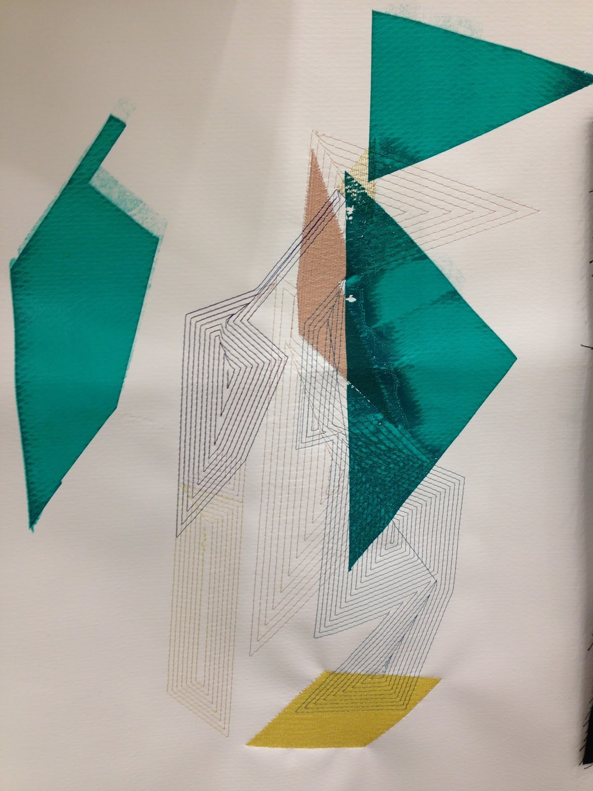
Out of the samples above, I believe the PVC as a background is a little stark for an interiors context. My designs look better integrated onto a neutral or black background and the effect created when the printing inks are layered over one another, particularly on the black fabric reinforces the geometric and transparent element I wanted to capture throughout this project. I enjoyed the process of using digital embroidery alongside screen print and combining them - when printing on top of the embroidery, the ink misses sections which is quite effective, and the stitch on top of the print also adds a graphic quality.

I would consider using the PVC for a live brief such as Michael Kidner as I feel it would be more effective for installation and gallery work rather than for an interior context.

Saturday 7 November 2015

Colour


Debenhams Autumn/Winter 2015
After the latest crit, I tried to develop another colour palette by photographing fruits which have a purple skin, such as figs and passion fruits as this colour is prominent within current interior fabrics in retailers such as Debenhams and John Lewis. I also agreed with my tutor when discussing that some of my recent samples looked a little 'washed out' on a white background.

 
Fig Colour Palette
Passion Fruit Colour Palette
After experimenting with these colour palettes within my samples this week, my favourite is the fig as it incorporates purple alongside an 'accent' colour which in this case is a medium yellow tone. I plan to carry on with sampling for my self-initiated project to be directed towards an interiors context. I would like to mix screen print and digital embroidery for my next samples and play with material and colour compositions.