Pages

Monday, 22 September 2014

Reflection of Summer Work - Feedback


To begin the new term, we got into groups and discussed how we thought the summer project went for us and showed the rest of the group some of our work - the good, the bad and the downright ugly. 


These were the favourite pieces from the discussions due to their diverse nature - figurative and abstract.

My peers liked the abstract, textural drawings and the colour combinations which I used throughout my drawings the most. They also agreed that my underpinning concept was strong which helped me to develop my artwork further through the summer. They gave me some further ideas however, such as layering texture over my own images to create abstract drawings which depict the idea of disguise and cover-up through other means. This could be done using tracing paper or printing onto acetate, for example. 


Some of the artists that were suggested to me to look at were; Maurizio Anzeri (above) who uses the human face and geometric shapes to create abstract qualities and Lucien Day and Angie Lewin who both use simple prints with linear features within their work.

The group all said that my drawings could be used effectively through embroidery as some were graphic rather than abstract, which could be mixed to create some interesting forms including backgrounds and foregrounds.It was also suggested I consider working in 2D and 3D methods to vary my outcomes.

Tuesday, 2 September 2014

Influences and Inspirations (2)

After researching images relating to disguise on Pinterest, I found that the ones that inspired me the most were the three in my previous post.

I went on to create collages of faces (as seen in my previous post - Waldemar Strempler) by cutting up the facial features of the people in magazines and rearranging them appropriately to create a new face - a 'disguise'. Some of the people look abstract, whereas others quite suit their new features. 


I mixed the idea of disguise with peacock feathers again to create more drawings - using the shapes of the peacock pattern to cover the eyes of someone, for example. I also used similar spherical shapes to create a collage covering the eyes of someone (above top right) - similar to Anton Bundenko.


Looking back at the work of Januz Miralles again, which I found earlier, I have distorted my own collages and found photographs of the human face (in the style of Waldemar Strempler) in order to create some more drawings. Adding different media such as acrylic paints and ink to the distorted images makes them more abstract and like a 'disguise' or a 'cover-up' and relates to the work of Miralles, also. 


I wanted to investigate the idea of disguising the face using other methods, such as covering up aspects of it with an object, or replacing features all together with something totally different - see my Pinterest (http://www.pinterest.com/rmlhaigh/disguise/) for other inspirations from artists such as Amy Judd, who uses animal features to cover the human face. Below, I used the ideas behind her work, teamed with the concept of an image of Twiggy that I discovered on Pinterest, to create my own piece.


I would say my work could be tailored towards the costume industry as I enjoy working with unusual concepts, in a three-dimensional manner. I like working in an abstract way as Miralles and Strempler do, though I am also inspired by unusual and shocking images like Amy Judd and Anton Bundenko create.

Luly Yang is a designer based in Seattle, USA, who predominantly creates gowns and bridal dresses, however, she also is involved in making Haute Couture fashion pieces such as 'The Monarch'.


 It is a custom silk taffeta butterfly print skirt and corset bodice, embellished with hand placed Swarovski crystals and black ostrich feathers. 


Wednesday, 16 July 2014

Influences and Inspirations

Near the beginning of the holidays I visited an Ice Cream Parlour near where I live. At this time I hadn't considered what I could concentrate my thoughts on during the summer break until I saw the peacocks there spreading their tail feathers to show their dominance. I was fascinated by the pattern and the colours that they displayed so I went on to consider how I could develop a project from this idea. My initial thought was that the feathers act as a 'disguise' for the birds so I would like to explore more closely the plumage of Peacocks along with the idea of Disguise. The regal colours in the tail feathers could be said to be the peacock's 'costume' because after stumbling across a white peacock on Pinterest, it appears that the colour has been removed from the bird or like it is wearing a costume/disguise.


I carried out two weeks of work experience over the summer at Lime Pictures in Liverpool in the costume and set department of Hollyoaks with a view to experiencing what design is like in industry. The costume department gave me an insight into forming a character over the artistes and made me think more closely about the art of disguise and costume.

After completing the experience at Hollyoaks, I began to brainstorm some different ideas based around the idea of 'disguise' on Pinterest. I wanted to research this idea in more depth and I found a selection of images where the faces of people have been separated and put back together in different compositions or distorted to look like something totally different entirely.


Waldemar Strempler  is an artist that uses collage and digital technologies to create abstract artwork based around the human body. 

This image is one of his more simple pieces, playing with the idea of a woman's facial features. The idea of disguise has the connotation of 'covering up' something or 'transformation' in my mind. 

The Girl with the Peacock Eyes - Anton Bundenko.
A way of altering someone's appearance using similar shapes to what is covered.


Januz Miralles also alludes to the human face, but covers it slightly with abstract shapes, forming a cover-up, a disguise.

I would like to now look in more detail at the ideas displayed above as well as removing colour, changing colour and texture and collaging in order to explore the idea of 'disguise' and 'cover-up' more broadly. 

Thursday, 8 May 2014

Passimentrie - Final Developed Samples

This week I have been working on developing different samples which demonstrate different ways of creating a sculptural, yet manipulated piece of fabric. 

I decided it would be beneficial to my project to cut up some of the giant grey rouleaux in order to develop it directly into several embroidered samples. Some of the better samples that evolved through the week are shown below. I left a large proportion of the giant rouleaux intact so that it didn't ruin the dramatic effect of it.


 I used different machine embroidery techniques such as Pin-Tucking, Taylor-Tacking, Cording and the Reed Pleater in order to develop the above samples.


I researched textile artists that use translucent materials to create structures and came across Jan Garside and Caroline Broadhead, whose pieces (seen above respectively), gave me an insight into a possible context for my work. My pieces could be part of a sleeve for fashion or could simply be a piece of material, for example.

In order to channel my thoughts, I chose some words to focus my mind which were reflective of the twisted reed pleater sample in my previous post and gathered images of the fairground scene. These were: Spring, Twist, Contort and Compress. I believe the samples that I have developed over the week are reflective of these words as well as being reflective of the colour palettes I originally depicted from the visit to Blackpool Pleasure Beach and the Belle Vue archive visit.

Below are some of the other samples that I have developed with those words in mind.  


I initially thought about ways of manipulating translucent fabrics such as silk organza, so I looked at a fabric manipulation book by Ruth Singer which inspired me to use box pleating and pressing the fabric to contort it (see above images). I chose to use velvet as it has a pile and would spiral quite easily when made into a rouleaux and would role itself round naturally if I left it. 

Throughout this project I have found certain aspects challenging as the majority of techniques were new to me. However, I feel that I have gained an insight into the world of weave, through the use of looms and different yarns and also through the reed pleater which allows woven but embroidered samples. I would say that I have enjoyed the project but I have found it easier to use embroidery techniques rather than the weave techniques I learned earlier on in the project. The range of samples I have created throughout the project depict the fun and the dark side of the fairground through the colour palette I have used. I feel that I could have been more innovative with drawing references and looked at more images in the first few weeks in order to kick start some of the ideas that I had later on in the project.


Rouleaux

After experimenting with ruffles on the body, I decided to look at other ways that ruffles could be effective. By twisting a sample that I made using the read-pleater, I noticed that it could be representational of a carousel pole (as seen on my previous post). 
After reassessing my original photographs from Blackpool and Belle Vue, as well as secondary images from Pinterest and the Internet, I was influenced by the twisted and contorted shape of the poles. I decided to get some of my ideas down onto paper, so therefore I began to draw again.

Drawing with twists and spirals.


I then wanted to experiment with different compositions in order to give me more ideas for sculptural work in future samples. I created a giant rouleaux and as it fell to the floor it created the spiral above. The string that I corded onto the organza fabric gave the rouleaux structure and allowed a more 3D outcome. I also like the way that the string curls up as it is forced into the spiral shape.


Twisting the rouleaux around a cardboard tube. Because the string is sewn tightly to the fabric, it allows the rouleaux to contort and twist which creates the rippled edge and an interesting texture.


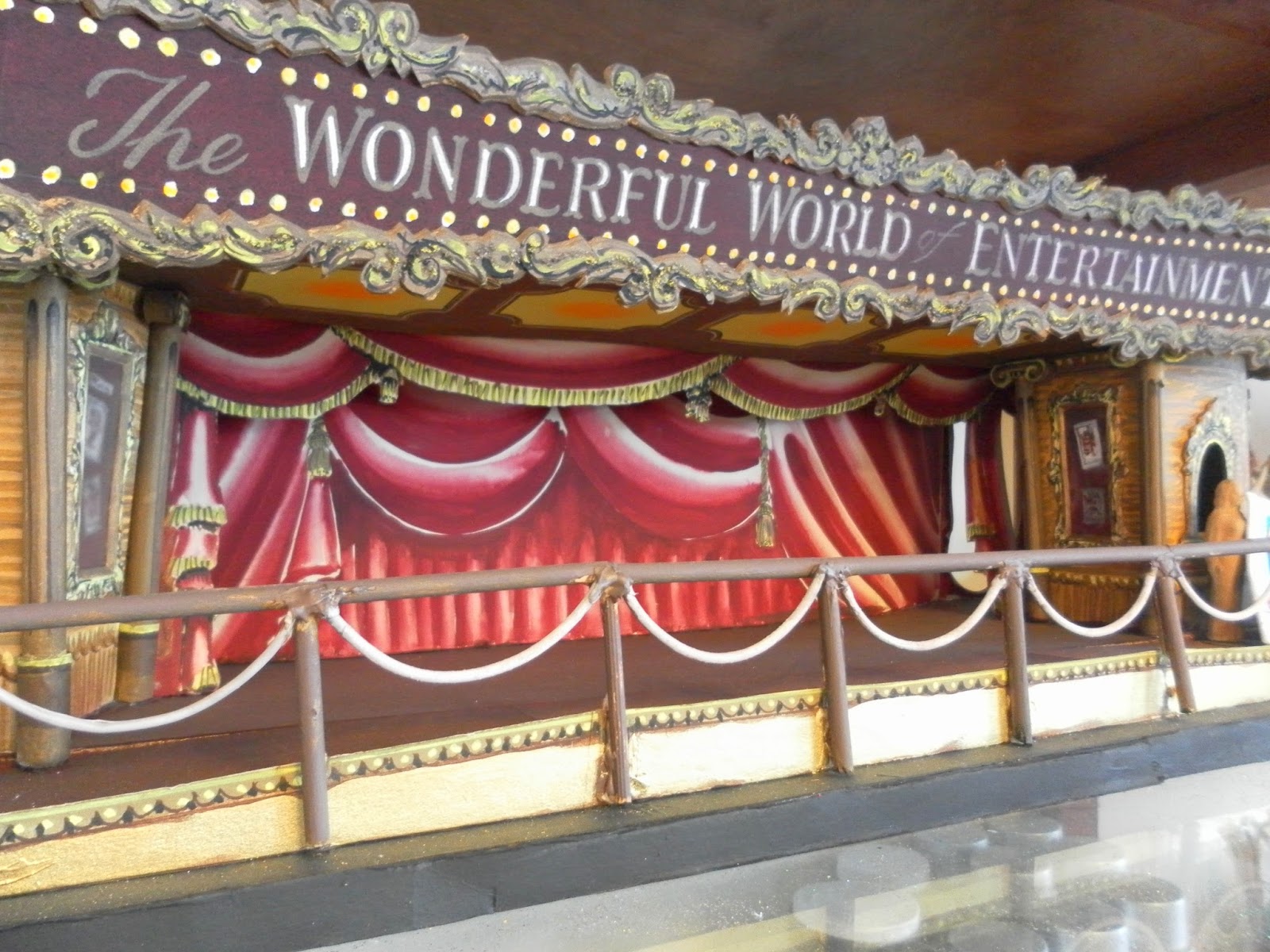
Experimenting with colour compositions - linked from previous research from Blackpool and original colour palettes - adding texture with edging. The pom-poms resemble the tassels on the curtains on the image above as well as the shape of the rouleaux being like the barriers in front as well as twisted like a carousel pole at a fairground.  


To move the project on for the final week and to finalise my ideas, I would like to experiment with manipulating fabrics in order to create interesting textures like I have achieved with considering a more structural approach. I will work with translucent materials to allow the stitch to show through and allow some more structural, manipulated samples. 

Monday, 7 April 2014

Lines of Enquiry

After experiencing the processes associated with weave, I have now moved onto the embroidery side of the Passimentrie project. I would like to collaborate these processes and the materials I used in order to influence ideas within the embroidery part of the project. This week I set out to create 'edges' from materials such as ribbons and trimmings which could be used in the interior or fashion industries. 

From weave, I have learned to appreciate colour and composition which I feel will allow me to think more sensitively within my embroidery. 


I have used already-learned processes such as hair-pinning, cording and appliqué as well as new processes such as ruffling, pleating and gathering in order to create these edges. 


Could this be an abstract representation of a carousel pole?

The processes that I feel have allowed me to develop key ideas the best were the Read Pleater and the wide gathering foot on the Bernina machines (although this took me a while to master). They have allowed me to take a more 3D, structural approach and are reflective of the rides I photographed on the visit to Blackpool Pleasure Beach at the beginning of the project. 


I would like to collaborate weave and embroidery more closely through ruffling and pleating as I found these processes surprisingly effective in creating woven, yet embroidered edges. I have found it easier to use embroidery processes to translate woven effects rather than on the weave looms specifically. 

For the exhibition at the end of the project, I would like to further collaborate embroidery with weave in order to create something more practical such as a collar or cuff, for example, or perhaps a more sculptural sample which I could display. I will use learned processes through weave and embroidery to do this and assess what has worked best throughout. 

To further develop my ideas I now need to research around the compositions of collars or cuffs or sculptural textiles so that I can create a sample around my current ideas and processes that I have learned so far. To carry out this contextual research I will look online at Pinterest or other blogging sites to take some inspiration from other designers that have done something similar. I will need to look more closely at the shape or the composition of the pieces that I find in order to influence how I could create my own.

Monday, 31 March 2014

Development of Weave Samples - Research

This week I set out to develop the samples I created from last week by relating the weave patterns and yarns more closely to my drawings and visual research from the archive visits. 


I gathered trimmings and yarns from fabric shops which relate closely to elements of the photos I took from the archives such as tassels and pom-poms which I will use in my woven samples. 


Experimenting with colour and arrangement of lines
I have learned to appreciate the ratio of colours within my work and how this relates to my drawings. I have been heavily influenced by different yarn qualities such as texture and compositions when arranged next to each other. I have also been strongly influenced by the tassels from the curtains of the 'Wonderful World of Entertainment' image above and my colour palette is tailored slightly more towards that image than others. 


I have attempted to experiment with different patterns on the loom, incorporating the colours and compositions from my drawings - the chevron pattern has interlinking lines which link to the majority of my drawings. The texture of the tassels in my original images and drawings is depicted through the use of pom-poms in all of my samples, whether they are brightly-coloured to symbolise fun at Blackpool Pleasure Beach or darker which represents the lack of fun and a darker side to fairgrounds such as Belle Vue.

Visit my Pinterest page to view some of the things that have inspired me through the start of this project along with contextual images. I feel that my samples would be tailored towards the interiors market, or perhaps as smaller pieces in the fashion sector such as collars or cuffs, for example. 

I wanted to experiment with the composition of my woven samples in order to refine my ideas and identify what has worked best so far in the project. 


I developed two more samples which are reflective of this; one being 'fun' like at Blackpool and one  being 'dark and scarce' like at Belle Vue.